|
My latest art project gave me the opportunity to work with 3-D media in order to emphasize an art element within my model. Sticking with fashion, I took on the challenge of modeling the precisely-shaped Crepe Boot, featured in season 2 of the YZY collection. Thought the time allotted did not permit the completion of my sculpture, the progress I made on it was quite impressive (especially considering my lack of practice with clay in over two years).
The creation process was fairly straightforward. I hand sculpted the overall shape of the Crepe Boot's silhouette, and worked with much precision and attentive to detail in order to replicate the original show to the best of my abilities. While sculpting the Crepe Boot, I used a wide array of clay tools, ranging from sharp knifes for accurate shaving, to kitchen forks for scoring prior to the application of slip. All of these tools were sued to create the end result. The main purpose behind this sculpture was to really challenge myself and break my own boundaries as it pertains to the art mediums which I tend to use.
0 Comments
 Artist Statement
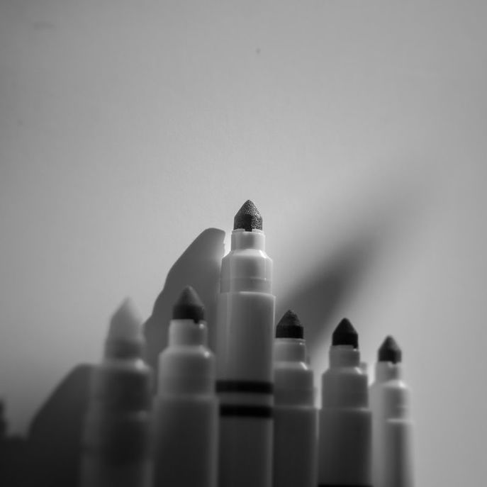
[ABOUT THIS SHOT] This photograph displays six markers lined up against a blank wall. The primary focus of this shot however, is the marker that seems to be sticking out, both literally and metaphorically. A ray of sunlight is shining on the raised marker, and reveals the fine details within its felt tip that is seen in none of the other five markers. The shadow of the upmost marker is also more defined. [CREATIVE PROCESS] Conceptual Development This single shot took immense effort and planning. The first step was to find my reference photo. After finding the concept behind a rather familiar photograph of colored pencils, my mind was set towards remixing and recreating the shot in order to even better show the advantages of being different. Shot Preparation I happened to find a strong beam of sunlight shining from the open ceiling of the atrium in my school. This added even more to the original concept, as it meant i could create some sort of spotlight for the marker. I then took a large blank sheet of glossy white paper to use as my background. I placed this against a wall where the beam of sunlight was shining. In order to keep the markers together, I used scotch tape on the ends of them, which I knew wouldn't be shown in the photograph. Framing My thought process now surrounded the framing of the shot. How could I incorporate the advantages of sticking out within a crowd of otherwise similarly compared things? I decided to capture the shot from an angle that would balance the spacing between the two markers to the left of the main marker, and those to the right of it. This would also work to add more depth to the shot, making it seem far more interesting to view. Lighting I now needed to decide on lighting settings. What type of emotion did I want to portray here? How did I want to use color (or a lack thereof) to influence this emotion? This was shot with a kit 18-55 lens at 100 ISO, at about 1/640s with my aperture stopped all the way down to 3.5. I knew that I wanted to portray rather deep emotion, therefore I would be converting this image to B&W during post-processing. The sunlight beam actually worked in a way I didn't think of before actually setting up the shot. Because of the different beams that the light cast, I came up with the idea of filtering it through a water bottle (filled with water) in order to control where the beam shined. I had a friend hold the water bottle slightly above the markers at an angle which created a spotlight on the primary marker. This step was very tedious, but paid off tremendously in the end. Post-processing After capturing a few variations of this shot, I used Adobe Lightroom for final shot selection, cropping, and all other post-processing steps. The main elements edited within this photo were the framing and size dimensions, exposure, shadow depth, and saturation. I made rather subtle adjustments to all of these elements and what resulted was the shot that you see above. [THE BIG IDEA] The Motive As mentioned before, this shot was inspired heavily by another popular photograph using colored pencils. The purpose of my photograph was to use this concept and take it a few steps further. Instead of colored pencils, I decided to go with colored washable markers. This made it a bit more challenging, but certainly added to the originality of the shot. The Purpose The purpose of this image is to demonstrate how beneficial it can be for an individual to be different from a crowd. By using the physical placement of the marker, I set it apart from the others on a literal basis. I ignored the "one-thirds" rule in order to control the focus point of this shot, as I offset the lack of balance which was created by a different number of markers on each side of the unique one. These elements help emphasize the attention placed on people who are different. The spotlight placed on the main marker shows that being unique will force others to notice the otherwise hidden attributes and details about you. Shining the beam of light on the end of the marker reveals small details that suggest the texture of the felt tip used used for releasing the ink. Those details fail to be revealed on the markers that are out of focus. The third and possibly most subtle feature that I used to better emphasize the main marker's presence was the shadows of the markers. As you can see, the shadow of the primary marker is far more prevalent that those of the others. While shooting, I noticed that the drastic shadows added a lot of character to each marker's being. I decided to use this element for controlling the amount of character and emphasis placed along with the markers. More subtle, soft shadows are far less noticeable than the sharp, defined shadow of the central marker. In relation to life, this signifies the strong footprint that is left by those unique individuals. [My thoughts] Overall, I feel that I executed this project very well. Considering the time restriction and the resources I had, this photograph does an excellent job portraying the message that I originally wanted to portray. The spontaneity of the entire shooting process made capturing this shot extremely fun. The final shot is viewed with emotion, and it is very interpretive. I couldn't ask for more from such a short amount of time for setup! 2/23/2017 0 Comments "Looks" Conceptual DesignArtist Statement
My finished piece is a conceptual book design, featuring streetwear-oriented outfits. This book, simply titled "Looks," showcases elements essential to modern design. The fits take inspiration from countless popular streetwear designers, brands, and bloggers. Creation of the book mockup was made possible through 3D modelling, graphic design, and photography. Combining these digital mediums allowed for the realistic presentation of a life-like zine, as opposed to flat 2D images of what would be printed pages. My primary objective with this zine was originally to showcase the overall aesthetic of modern streetwear. In addition, I wanted to incorporate elements of successful design. These include adequate use of negative space, color blocking, geometric framing, and several other often overlooked aspects of design. In conclusion, I feel that this project was certainly a challenge for me after I got started. Developing a final idea was painfully difficult, as I was faced with a strict timeline for completion. File management became an issue later on in the creation process, as I lost about ⅘ of the work I’d completed. Overall however, I feel that I did a great job capturing the planned images on a daily basis within the time allotted. I didn't get to incorporate all of the graphical elements I would’ve liked, but the modelling of the mockup was certainly a great accomplishment for me. |
AuthorWrite something about yourself. No need to be fancy, just an overview. ArchivesCategories |
 RSS Feed
